Unlock The Vibrant Hues Of Happiness: Yellow, Orange, And Blue

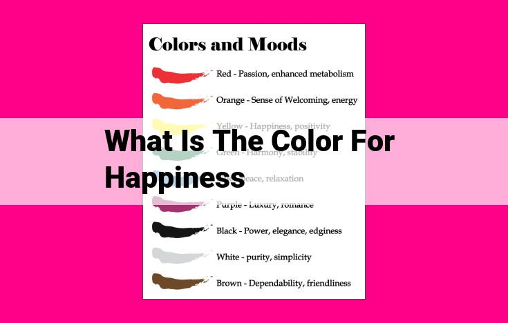
The color of happiness is widely associated with warm and vibrant hues, particularly yellow, orange, and blue. Yellow exudes optimism and cheerfulness, often used to create cheerful and welcoming spaces. Orange represents enthusiasm and creativity, known to boost energy and improve mood. Blue, though typically associated with calmness and serenity, has been found to enhance feelings of joy and contentment when used in bright and saturated shades.
Colors Associated with Happiness: Unlocking the Power of Hues to Elevate Mood
Prepare yourself for a vibrant journey as we explore the captivating world of colors and their remarkable ability to ignite happiness within us. Join us as we delve into the captivating fusion of science, art, and culture, unlocking the secrets of hues that evoke joy and brighten our lives.
From the radiant glow of yellow to the serene expanse of blue, certain colors have consistently been linked to positive emotions. Imagine strolling through a sunlit meadow, enveloped by the cheerful blooms of goldenrod and sunflowers. Their vibrant shades have the power to lift our spirits and chase away gloom. This is the essence of the colors associated with happiness.
The Science of Color and Emotion: How Hues Paint Our Moods
Have you ever noticed how certain colors evoke distinct emotions within you? It’s no coincidence. The science of color psychology has meticulously studied the profound impact colors have on our moods and behaviors.
Color psychology is the study of how different hues influence our psychological processes. It’s based on the premise that colors trigger specific neurological responses that can alter our feelings and perceptions. For instance, warm colors like yellow and orange have been found to stimulate activity in the brain’s reward pathways, promoting feelings of happiness and optimism.
The field of color psychology finds extensive applications in various domains, including design and marketing. Understanding the emotional associations evoked by different colors enables designers to create spaces that elicit specific moods and marketers to craft persuasive campaigns that resonate with consumers’ emotions.
For example, restaurants often use warm colors like red and orange in their interiors to stimulate appetite and create a convivial atmosphere. Blue, on the other hand, has been found to have a calming effect, making it an ideal choice for bedrooms or meditation spaces. Similarly, marketers utilize color to evoke emotions in their packaging and advertising campaigns, influencing consumer purchasing decisions.
Colors Proven to Enhance Happiness
Yellow: The Radiance of Joy
Yellow, like the warm embrace of the sun, embodies joy and positivity. Its cheerful hue has been found to enhance mood, increase energy levels, and boost creativity. Schools and hospitals often incorporate yellow accents to create an uplifting atmosphere. The bright yellow taxis of New York City are a testament to its mood-boosting effects.
Orange: A Burst of Optimism
Orange, a vibrant blend of yellow and red, radiates optimism and enthusiasm. It is associated with warmth, happiness, and abundance. Orange is often used in branding to evoke feelings of joy and excitement. For instance, the well-known food delivery platform DoorDash features a bold orange logo that instantly sparks a positive sentiment.
Blue: Tranquility and Contentment
Contrary to common misconceptions, blue is not solely associated with sadness. Certain shades of blue, like azure and sky blue, have been linked to tranquility and contentment. Studies have shown that exposure to blue reduces stress and promotes relaxation. Many offices and homes incorporate blue accents to create calming and productive environments. The iconic blue walls of Facebook’s headquarters are a prime example.
Famous Artists and Their Use of Happy Colors
Throughout history, renowned artists have harnessed the power of vibrant colors to evoke joy and happiness in their paintings. These masters have skillfully employed hues that radiate warmth, positivity, and a sense of wonder. Let’s delve into their works and discover how they skillfully used color to express the full spectrum of happiness.
Vincent van Gogh: A Symphony of Sunflowers
Vincent van Gogh’s brushstrokes danced with shades of yellow, creating masterpieces that illuminated the canvas with happiness. His famous “Sunflowers” series radiates a golden glow, evoking feelings of warmth and optimism. Van Gogh’s use of intense colors aimed to provoke emotions and inspire joy in the viewer.
Claude Monet: A Garden of Joy
Claude Monet’s Impressionist landscapes are renowned for their serene and uplifting atmospheres. In works like “Water Lilies,” he masterfully captured the play of light on water, creating iridescent hues that spark tranquility and happiness. Monet’s delicate brushwork and vibrant greens and blues invite viewers to immerse themselves in a world of natural beauty and contentment.
Henri Matisse: A Burst of Joy
Henri Matisse’s art exudes a carefree and celebratory spirit. His bold use of primary colors and simplified forms conveys a sense of spontaneity and joy. In paintings like “The Dance,” Matisse’s figures dance and swirl in a kaleidoscope of colors, creating a dynamic and joyful composition.
Wassily Kandinsky: Colors of the Soul
Wassily Kandinsky’s abstract paintings explored the emotional and spiritual power of colors. He believed that colors could resonate with our inner selves and evoke profound emotions. In works like “Composition VII,” Kandinsky uses geometric shapes and vibrant hues to create a visual symphony that transports viewers to a realm of pure joy and transcendence.
Alexander Calder: Mobiles of Happiness
Alexander Calder’s kinetic sculptures, known as mobiles, bring a sense of playfulness and delight to any space. These suspended works of art dance and twirl, casting colorful shadows that create a whimsical and uplifting atmosphere. Calder’s mobiles inspire joy and a sense of wonder in both young and old.
The works of these renowned artists demonstrate the extraordinary power of color to evoke joy and happiness. From the vibrant sunflowers of Van Gogh to the serene landscapes of Monet, the bold colors of Matisse to the abstract compositions of Kandinsky, and the playful mobiles of Calder, these artists have left an indelible mark on the world, bringing smiles and moments of pure joy to countless people.
Color Therapy for Happiness
Colors hold a profound impact on our emotions, and they can be harnessed to uplift our spirits and boost our happiness. Color therapy, also known as chromotherapy, is an ancient healing practice that utilizes the power of colors to improve our well-being.
Incorporating Happy Hues into Your Surroundings
Surrounding yourself with colors that evoke joy and positivity can create a transformative effect on your mood. Here are some practical tips for incorporating happy colors into your environment:
- Clothing: Wear bright and vibrant colors like yellow, orange, and blue, which are known to stimulate feelings of happiness.
- Accessories: Add a pop of color to your outfits with colorful accessories, such as scarves, hats, and jewelry.
- Home Décor: Paint your walls in cheerful shades like sunny yellow, calming blue, or uplifting green. These hues can brighten up your living space and promote a positive atmosphere.
The Benefits of Color Therapy
Studies have shown that color therapy can effectively improve mood, reduce stress, and increase overall well-being. Here are some of the therapeutic benefits of specific colors:
- Yellow: Stimulates joy, optimism, and creativity.
- Orange: Encourages enthusiasm, warmth, and confidence.
- Blue: Promotes serenity, tranquility, and relaxation.
Incorporating happy colors into your life is a simple yet powerful way to enhance your happiness. Whether you surround yourself with bright clothing, colorful accessories, or a vibrant home décor, the positive effects of color can transform your mood and uplift your spirit.
Cultural Variations in the Color of Happiness
While some colors, like yellow, are universally associated with joy, the link between colors and happiness can also vary significantly based on cultural context.
In China, for example, red is considered an auspicious color associated with good luck, prosperity, and happiness. This is why it is frequently used in traditional Chinese decorations, clothing, and festivals.
In contrast, in many Western cultures, blue is often associated with sadness or melancholy. However, in ancient Egypt, blue was revered as a sacred color that represented the goddess of the sky and was associated with joy and contentment.
These examples highlight how cultural beliefs and norms can shape the way we perceive and interpret colors. It is important to be aware of these cultural differences when designing spaces or creating products intended for a global audience.
By understanding the cultural context of colors, we can ensure that our use of color effectively conveys the desired emotions and positive associations.


